Doug Lane

SQL Server Entertainer

  • GitHub
  • LinkedIn
  • Twitter
  • YouTube
  • Blog
  • About Doug

Reporting Services 2012 Bug Causes Export to Excel Failure

March 14, 2013 by Doug Lane

Finally, FINALLY, I get to tell my boss the report subscriptions broke and it’s the server’s fault.

Here’s what happened: I took a report that ran perfectly on a SQL 2008 server and deployed it to Reporting Services on a SQL 2012 server. I tried to export it to Excel and got this delightful little message.

ExcelSSRSError
This particular report had no parameters and no custom code, so I was confident in ruling out an error on my part. I tried to work around it by exporting from the print layout, but still got the same error.
I then checked the Reporting Services log files and found this:

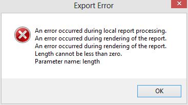
WARN: Microsoft.ReportingServices.ReportProcessing.UnhandledReportRenderingException: An error occurred during rendering of the report. —> Microsoft.ReportingServices.OnDemandReportRendering.ReportRenderingException: An error occurred during rendering of the report. —> System.ArgumentOutOfRangeException: Length cannot be less than zero.

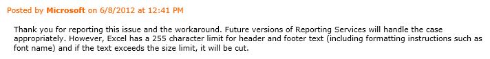
While the detail of that message didn’t help me deduce anything new, it did give me more precise phrasing with which to search. That led me to find this confession connect item from Microsoft: SSRS 2012 Export to Excel Footer bug. This is the Connect Team’s response to the item:

TheyBrokeExcel

Although there aren’t any workarounds added to the item, there’s one outlined in the initial item description. It says to place footer text in an image and drop that into the footer instead of a text box. I tried a number of other workarounds using background images, tables, and rectangles, but this is the only one I’d say was reasonably successful.
A few things to keep in mind if you’re going to need this workaround:
  • Save your text-as-image at a print quality resolution. 300 dpi is good. My company recently standardized headers and footers in our reports and we discovered the chunky, almost unreadable output of a 72 dpi image.
  • You still have 255 characters that will render. As the Connect Team comment says, some of that will be lost to the formatting tags. Still, if you put information like report date or page numbers, they’ll likely fit and render properly. It’s the long text like disclaimers and footnotes that you’ll need to use an image for.
  • This is only for SQL Server 2012. I’ve tested it and versions 2008 and 2008 R2 don’t fail this way. Consider passing broken reports through your 2008/2008 R2 report servers if that’s an option.

I like this workaround as a general practice anyway. At my company, we’re using images for the disclaimer in our report footers. If the text needs updating, we simply update the image and the reports that call it pick up the new image automatically. This technique is very simple to implement. Just do the following (I’m using SSDT):

  1. Right-click on the Reporting Services project name and choose Add > Existing Item.
  2. Change the file type drop-down to “All Files”.
  3. Find the image you want to use and click “Add”. Unfortunately, there isn’t a Miscellaneous folder like there are in SSIS and SSAS projects. Instead, your image will get added to the Reports folder.
  4. Add a new image to the report. The Image Properties window will appear.
  5. Change the “Select the image source” drop-down list to External.
  6. Choose the image from the “Use this image” drop-down list. Images attached to the project will be at the top of the drop-down list.
  7. Click “OK”.

The Connect item is “Closed as Fixed”, meaning they made sure future versions won’t have this issue. However, this doesn’t mean there’s a fix available for it right now. For the time being, the workaround is the best way to get the export to Excel function to not error out. This is a big enough deal that I hope the fix is coming in the next service pack, and we won’t have to live with it until the next full product version.


Filed Under: Reporting Services

Fit Chart Labels Perfectly in Reporting Services using Two Powerful Properties

February 19, 2013 by Doug Lane

Labels that refuse to fit along a chart axis are one of the most frustrating problems to deal with in Reporting Services. When trying to make them fit, we have a few basic options:

  1. Make the chart bigger.
  2. Make the labels smaller.
  3. Move or remove the labels.

Option #1 gets ruled out frequently for information-dense layouts like dashboards. Option #2 can only be used to a point; fonts become too difficult to read below 6pt (even 7pt font can be taxing to the eyes). Option #3 – angled/staggered/omitted labels – simply may not meet our needs. Are we out of options, then?

Not yet. There’s one more option when our labels refuse to fit.

  1. Give white space back to the objects inside the chart.

When I first started creating reports, I spent hours and hours trying to nudge objects this way and that. I grew them and shrunk them, trying to get everything to fit just right. Then I found out I could reclaim white space to use for labels and chart space. It was a game changer, turning hours of flailing through properties into minutes of educated guesswork.

A classic example of borrowing some white space is a twelve-month chart. Standard English month abbreviations are three or four characters long. Unfortunately, this happens a lot:

CIPP_D
Looks like another lunch at my desk while I fix this. Thanks a lot, May.

We’re so, so close to making it all fit. I’ll bet we can make it work if we just borrow a little white space.

(Besides, we don’t want Megatron to vaporize one of the lesser Decepticons down in Accounting over this; he’s very temperamental about his sales reports.)

In the properties window (F4 is the shortcut key for that) and click in the chart area, we’ll see two subheadings under Position that are collapsed by default. These are our two new best friends: CustomInnerPlotPosition and CustomPosition. Expanded, they reveal this:


The two properties that will save you hours of nudging and noodling.
The two properties that will save you hours of nudging and noodling by making you spend minutes nudging and noodling.

The window says they’re disabled, but that’s not really true. Rather, our chart is using the default values listed under the Height-Left-Top-Width settings. What do these numbers mean, and what’s the difference between the CustomInnerPlotPosition and CustomPosition properties? Let’s look at a picture (we’re visualization people, right?)

The three chart parts: Chart, Chart Area, and Inner Plot Area

The chart object is made up of three distinct areas:

  • Inner Plot Area: contains all the plotted visuals, e.g., bars, lines, points
  • Chart Area: contains the Inner Plot Area + axis labels
  • Chart: contains the Chart Area + titles, legends, and white space

Note: Unfortunately, when you’re designing reports in BIDS or SSDT, there’s no reference to an “Inner Plot Area”. Instead it’s called the Chart Area. What we’re calling “Chart Area” in this article has no referential equivalent in the report designer.

Now that we know what the chart parts are, let’s look at the chart with the CP/CIPP numbers together.

Chart with its default CustomPosition and CustomInnerPlotPosition values.

The numbers for each property are actually percentages, from 0-100, and relate to the object in which they are contained. This means, in English:

  • The Chart Area
    • Begins (percentage-wise) 19% from the top edge of the Chart
    • Begins 3% from the left edge of the Chart
    • Spans 94% of the Chart width
    • Spans 77% of the Chart height
  • The Inner Plot Area
    • Begins (percentage-wise) 4% from the top edge of the Chart Area
    • Begins 11% from the left edge of the Chart Area
    • Spans 80% of the Chart Area width
    • Spans 71% of the Chart Area height

Two important points to make, then we’ll get on to fixing our labels (I promise):

  1. Because the CustomInnerPlotPosition numbers are in relation to the Chart Area and the numbers are on a scale of 0-100, we cannot grow the Inner Plot Area beyond the edges of the Chart Area.
  2. The Chart and Inner Plot Area + Chart Area exist on separate Z-axes. In other words, they overlap visually. When you really need to pack objects like the legend and chart title in tightly, use this to your advantage.

Okay, let’s see the properties in action. We’ve seen the defaults when they’re disabled. Here are some other values and the visuals they produce:

Maxed out We’ve maxed-out both properties here. The Inner Plot Area is given 100% of the Chart Area, and the Chart Area is given 100% of the Chart as a whole. Therefor, the Inner Plot Area occupies the entire chart and leaves no room for the axis labels. Note, however, the overlapping layers with the Chart contents on top of the Inner Plot Area contents.We’ve got a title on this graph only, just to see how it bumps the legend down. It has no effect on the Inner Plot Area or the Chart Area.
CIPP7 This time we give the chart a little white space around the edges but everything inside of that belongs to the Inner Plot Area. Again, we haven’t left sufficient room to render any axis labels (they’re not turned off).
CIPP_A A little too far in the other direction, we only allocated 70% of the chart to the Chart Area, and only 80% of that space (56% for the non-math majors out there) is used for drawing the Inner Plot Area. Not surprisingly, our labels are really smashed together. If you need extra space for a legend or a background image, this is how to get it.

Now that we understand what the numbers do, it’s a matter of experimentation – finding out what numbers work to get us the results we want. In this case, we don’t care about titles for the chart or axes. We just want the axis labels to fit.

After some fiddling with the numbers, here is our winner:

Ding ding ding ding! We have a winner!
If you were lucky, it only took you six minutes to get this right.

Laserbeak and Vortex down in Accounting will be relieved!

CustomPosition and CustomInnerPlotPosition can save you a great deal of frustration when dealing with small or dense graphs. They aren’t complex properties, but they aren’t well documented either — even by Microsoft. They’re indispensible enough that I hope they make their way into Power View (which employs generous buffers of white space).

I’ll throw this out too: labels and legends also have a CustomPosition property. Enjoy!

I hope by knowing these properties, you’ll be well equipped to deal with labels and legends that stubbornly refuse to display correctly. Will these properties save you time and agony? Do you have another trick for squeezing labels into place? Let me know in the comments!


Filed Under: Reporting Services Tagged With: Charts, CustomInnerPlotPosition, CustomPosition, Labels

MCTS 70-448: Failure is a Fine Option

July 1, 2011 by Doug Lane

This was the second time I failed a certification exam, and the first time I expected to fail. It’s also the first time I’ve been perfectly content with failing.

I took the MCTS 70-448 – Business Intelligence exam yesterday morning only because I had to. I signed up for the three-exam pack offered by Microsoft and Prometric on June 22, and as a requirement I had to sit for an exam before July 1. Having only eight days to study, I put my odds of passing around fifty-fifty. I knew I’d do well at Integration Services, I’d do very well at Reporting Services, and I’d need to remember everything I’d crammed in the last three days in order to salvage the Analysis Services section.

That’s pretty much how it went.

70-448 Exam Breakdown, Doug Lane, June 2011
What almost passing looks like

While the pass/fail result met my expectations, I was surprised to learn from the test that:

  • I know more than I thought I knew about deploying Integration Services.
  • I know less than I thought I knew about developing Reporting Services.
  • Apparently, I am as proficient at deploying SSAS solutions as I am developing an SSRS solution. (Riiiiiiiiiight.)

But most importantly:

  • With a score of 610, I was dangerously close to passing (700), and I will absolutely pass this exam on my second try.

I was happy about failing for two reasons. First, I didn’t crash and burn in any one category and my overall score tells me I’m on solid ground with this material. Second, I often hear that certifications (especially the lower-level Microsoft ones) are “not worth the paper they’re printed on.” Had I passed today, armed with little book knowledge and virtually no real-world experience of Analysis Services, I would have done the certification a disservice. I didn’t deserve it this time.

Fortunately, I have two things working in my favor for re-taking the exam. First, I have a free second shot (part of the exam pack offer), which I hope to take in the next 30 days, while the material is still fresh in my head. Second, I just started prototyping an Analysis Services solution — my first ever — at work. My boss is very enthused about the potential for this project, so I can allocate plenty of time to it right away. With a little hands-on experience and more study time, I’m going to do just fine on the re-take.

In my eleven-year history of certification exams, I’m now 8-for-10. That’s okay. Failing the 70-448 this time just feels right.

Filed Under: Analysis Services, Career, Certification, Integration Services, Reporting Services

Cooking Fonts to Order with Reporting Services

April 28, 2011 by Doug Lane

Giant Rooster with Chef's Hat
“For you, I make an extra-special 7pt Calibri. BAWK BAWK!”

If you go to a restaurant often enough, you’ll get to know the people who work there — the hosts, wait staff, managers, and perhaps even the cooks.  One of the perks of a good relationship with the staff is access to dishes that aren’t on the menu.  It could be a new creation the chef is working on, or a special that isn’t on the menu anymore but the chef still knows how to make.

The more I work with Reporting Services (specifically with BIDS), the more I find it to be like a restaurant.  If you know what to ask for, often you can get things that aren’t on the menu.  Take fonts for example.  If you click on the drop-down list for the font size, you’ll see a bunch of values beginning with 8 and ending with 72.  The values are in order but increment at expanding intervals (8, 9, 10, 11, 12, 14, 16, 18…).  One may think that these are the only possible values for font size in reports.  One would be wrong.

Frequently, I’ve had to cram a ridiculous amount of information on one page.

Feel a little dirty just looking at it, don’t we?

(Sometimes people simply don’t want visual representations of data; they just want lots and lots of tiny numbers.  If you’ve ever told Excel to print three pages of data, fitting to 1 x 1, we feel each other’s pain.)   In these cases, 8-point fonts simply won’t be small enough to get the job done.  That’s when it’s time to order something not on the menu.

Try this and see what happens: On any report, select a textbox with some text in it. In either the font size drop-down list or the properties window (use the [F4]ce, Luke!), type in the font size of 7pt.  What happened?

(I’m going to assume you actually tried it or you know the answer already.)

It changed the font size to 7pt and the text is noticeably smaller.  Now try this:  Change the font size again to 6pt.  Did it get smaller?  You bet it did!  How far can we dip under the limbo stick, you might wonder?  I printed off the chart below and as you can see, anything under 5pt gets to be unreasonably small.  Even 5pt is pushing the limits of user-friendliness and should be saved for legalese and other acts of deception.  Notice something else too — once you reach 8pt, anything less must be a whole number. If it’s not, BIDS will round it down. 7.5pt font looks the same as 7 because 7.5 is invalid and BIDS rounds it to 7.

Inspecting the three common fonts reveals another interesting fact.  Different fonts render at different sizes despite the same font size setting.  Notice how Calibri 7pt comes out a little smaller than Arial 7pt.  Keep this in mind next time you need to pack a lot of text or table data into one page of a report.  If you can’t get it all to fit and you’ve gone as small as you can go with one font, try the same size with a different font.

When working with Reporting Services, I highly recommend asking for things not offered on the menu.  You’d be surprised not only what it can cook up, but how willing it is to try.

Filed Under: Reporting Services

T-SQL Tuesday #016: Aggregations in Reporting Services

March 8, 2011 by Doug Lane

It’s Tuesday, which means two things:

  1. I may or may not be out of Craisins…not sure.
  2. Time for a T-SQL Tuesday post.

I’ll check on the Craisins later.  Let’s do the post.

Last I checked, most elementary school children can take a list of numbers and add them up as they go.  That is, give them a list of 3 + 4 + 5 + 1 and they’ll probably tell you 3 + 4 = 7, 7 + 5 = 12, and 12 + 1 = 13.  Simple, right?  If you ask them to sort it from lowest to highest, omit the odd numbers, and make a second list based on numbers in the first, they’ll stare at you, then tell you they had an accident in their pants.

Did I mention I'm pretty good at coloring, too?

Reporting Services works much the same way.  If you ask it to do things it can do as processes data row by row, like RowCount, Sum (with or without an explicitly defined scope), or even Previous, it’s pretty efficient.  However, if you ask it to start shuffling items around (sorting), cutting items out (filtering), or relating items to each other (subreports), Reporting Services is not able to deal with it as efficiently.  Why is that?

Reporting Services has no indexing on its datasets.  None.  Zero.  Zilch.  Nada.  The null set.

BingGoogle “Reporting Services Indexes” and you’ll get results less useful than those Ensure coupons the grocery store registers insist on printing for me.  (I’m a 35 year-old man!  Give me something I’ll actually use, like a dollar off Craisins!  I’ll bet that Ensure nonsense comes from a bloated Access database in Branson.)

Once the dataset comes back from the data source, it’s nothing more than an ordered heap.  Performance-wise, datasets in Reporting Services behave a lotlike ASP.NET datasets.  If you return thousands of records in either one, then sort and/or filter them in the dataset rather than getting them pre-sorted/filtered, you’re wasting precious seconds.  Several seconds may not seem like a big deal, but to a user watching the spinning green circle, the difference between two seconds and ten is an eternity.  That said, if your report is interactive and the typical use case involves a lot of manipulation, it may be worth letting Reporting Services shuffle the dataset, rather than pounding the data source again and again with variations of the same data.  It depends.

If you’re trying to decide where the summation logic should go when designing a report, treat the Reporting Services like a little 2nd grader.  If you want it to count the items as it goes (RowCount), add them up as it goes (Sum), or tell you what item it just looked at (Previous), you’ll be just fine.  If you want something more complicated than that and your dataset is not insignificant in size, ask its older sibling — the database engine — to do the work.  Otherwise, you’ll likely see Report Server poop its performance pants when you check ExecutionLog2.

But then, what do I know?  I’m still not sure if I’m out of Craisins.

Filed Under: Reporting Services, T-SQL Tuesday

  • 1
  • 2
  • Next Page »

Subscribe now!

Don't miss new posts as they publish. Enter your e-mail address to subscribe!

Your e-mail address will stay quietly between us, like that time I set the carpet on fire by accident.

Copyright © 2025 · Outreach Pro on Genesis Framework · WordPress · Log in