Labels that refuse to fit along a chart axis are one of the most frustrating problems to deal with in Reporting Services. When trying to make them fit, we have a few basic options:
- Make the chart bigger.
- Make the labels smaller.
- Move or remove the labels.
Option #1 gets ruled out frequently for information-dense layouts like dashboards. Option #2 can only be used to a point; fonts become too difficult to read below 6pt (even 7pt font can be taxing to the eyes). Option #3 – angled/staggered/omitted labels – simply may not meet our needs. Are we out of options, then?
Not yet. There’s one more option when our labels refuse to fit.
- Give white space back to the objects inside the chart.
When I first started creating reports, I spent hours and hours trying to nudge objects this way and that. I grew them and shrunk them, trying to get everything to fit just right. Then I found out I could reclaim white space to use for labels and chart space. It was a game changer, turning hours of flailing through properties into minutes of educated guesswork.
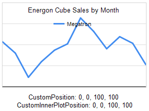
A classic example of borrowing some white space is a twelve-month chart. Standard English month abbreviations are three or four characters long. Unfortunately, this happens a lot:
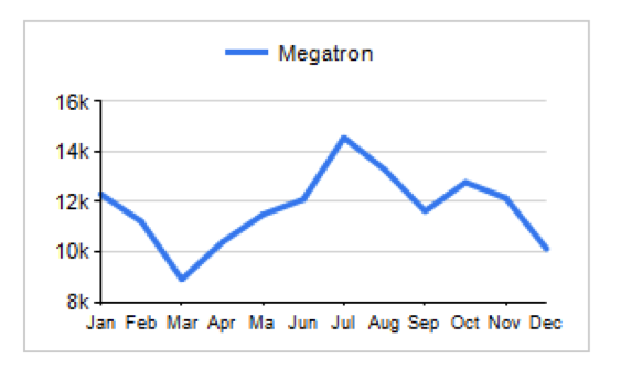
We’re so, so close to making it all fit. I’ll bet we can make it work if we just borrow a little white space.
(Besides, we don’t want Megatron to vaporize one of the lesser Decepticons down in Accounting over this; he’s very temperamental about his sales reports.)
In the properties window (F4 is the shortcut key for that) and click in the chart area, we’ll see two subheadings under Position that are collapsed by default. These are our two new best friends: CustomInnerPlotPosition and CustomPosition. Expanded, they reveal this:
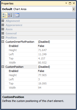
The window says they’re disabled, but that’s not really true. Rather, our chart is using the default values listed under the Height-Left-Top-Width settings. What do these numbers mean, and what’s the difference between the CustomInnerPlotPosition and CustomPosition properties? Let’s look at a picture (we’re visualization people, right?)
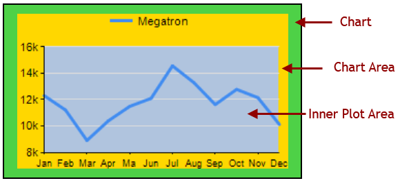
The chart object is made up of three distinct areas:
- Inner Plot Area: contains all the plotted visuals, e.g., bars, lines, points
- Chart Area: contains the Inner Plot Area + axis labels
- Chart: contains the Chart Area + titles, legends, and white space
Note: Unfortunately, when you’re designing reports in BIDS or SSDT, there’s no reference to an “Inner Plot Area”. Instead it’s called the Chart Area. What we’re calling “Chart Area” in this article has no referential equivalent in the report designer.
Now that we know what the chart parts are, let’s look at the chart with the CP/CIPP numbers together.
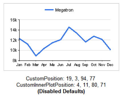
The numbers for each property are actually percentages, from 0-100, and relate to the object in which they are contained. This means, in English:
- The Chart Area
- Begins (percentage-wise) 19% from the top edge of the Chart
- Begins 3% from the left edge of the Chart
- Spans 94% of the Chart width
- Spans 77% of the Chart height
- The Inner Plot Area
- Begins (percentage-wise) 4% from the top edge of the Chart Area
- Begins 11% from the left edge of the Chart Area
- Spans 80% of the Chart Area width
- Spans 71% of the Chart Area height
Two important points to make, then we’ll get on to fixing our labels (I promise):
- Because the CustomInnerPlotPosition numbers are in relation to the Chart Area and the numbers are on a scale of 0-100, we cannot grow the Inner Plot Area beyond the edges of the Chart Area.
- The Chart and Inner Plot Area + Chart Area exist on separate Z-axes. In other words, they overlap visually. When you really need to pack objects like the legend and chart title in tightly, use this to your advantage.
Okay, let’s see the properties in action. We’ve seen the defaults when they’re disabled. Here are some other values and the visuals they produce:
 |
We’ve maxed-out both properties here. The Inner Plot Area is given 100% of the Chart Area, and the Chart Area is given 100% of the Chart as a whole. Therefor, the Inner Plot Area occupies the entire chart and leaves no room for the axis labels. Note, however, the overlapping layers with the Chart contents on top of the Inner Plot Area contents.We’ve got a title on this graph only, just to see how it bumps the legend down. It has no effect on the Inner Plot Area or the Chart Area. |
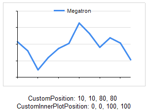 |
This time we give the chart a little white space around the edges but everything inside of that belongs to the Inner Plot Area. Again, we haven’t left sufficient room to render any axis labels (they’re not turned off). |
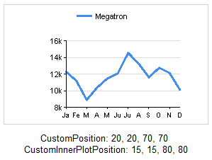 |
A little too far in the other direction, we only allocated 70% of the chart to the Chart Area, and only 80% of that space (56% for the non-math majors out there) is used for drawing the Inner Plot Area. Not surprisingly, our labels are really smashed together. If you need extra space for a legend or a background image, this is how to get it. |
Now that we understand what the numbers do, it’s a matter of experimentation – finding out what numbers work to get us the results we want. In this case, we don’t care about titles for the chart or axes. We just want the axis labels to fit.
After some fiddling with the numbers, here is our winner:
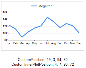
Laserbeak and Vortex down in Accounting will be relieved!
CustomPosition and CustomInnerPlotPosition can save you a great deal of frustration when dealing with small or dense graphs. They aren’t complex properties, but they aren’t well documented either — even by Microsoft. They’re indispensible enough that I hope they make their way into Power View (which employs generous buffers of white space).
I’ll throw this out too: labels and legends also have a CustomPosition property. Enjoy!
I hope by knowing these properties, you’ll be well equipped to deal with labels and legends that stubbornly refuse to display correctly. Will these properties save you time and agony? Do you have another trick for squeezing labels into place? Let me know in the comments!